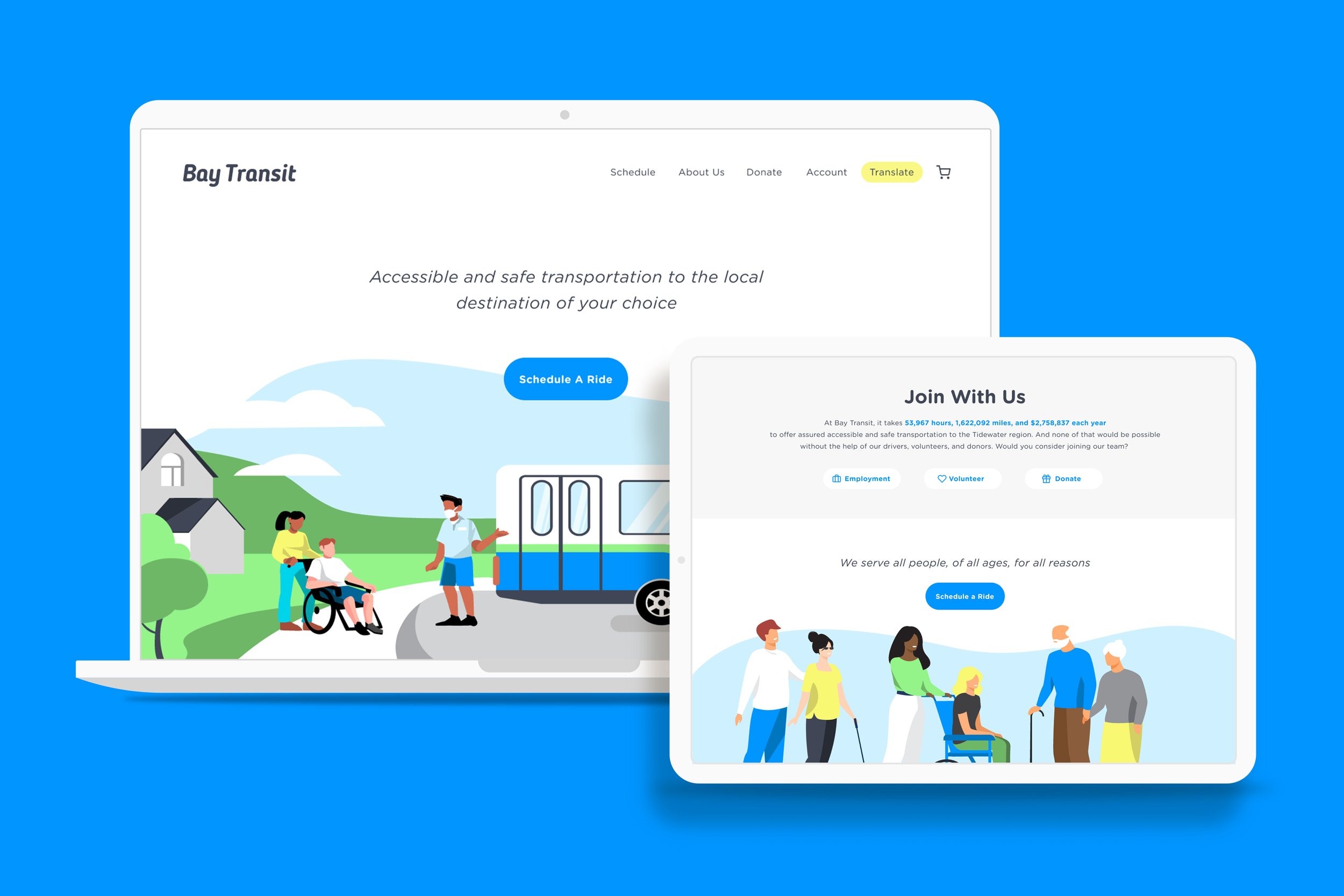
Bay Transit
Responsive Web Design For A Local Non-Profit
Bay Transit is a non-profit public transportation service that believes every citizen should be assured accessible and safe transportation to the local destination of their choice without regard for disability, age, or economic status. My challenge? Build a responsive website to help them achieve that mission.
This project is for an assignment I completed for Designlab’s UX Academy and is not apart of Bay Transit.
The Before
Home Page
Schedule A Ride Page
Contact Us Page
About Rivah Ride Page
Duration of Project
2 Weeks / 14 Days / 80 Hours

Project Lead
I was the end-to-end UX/UI designer for this project

TOols Used
Figma, Adobe Illustrator, Whimsical, Google Forms, Miro
The Problem
A non-profit transportation service that offers equal opportunity rides for people of differing abilities but has a website this is not accessible to these people groups.
my Hypothesis
More people of differing abilities would be able to use Bay Transit's transportation services if they had a responsive website to book their travel.
The Process
Competitive Research
To begin testing my hypothesis, I wanted to compare how other Virginia public transportation and paratransit companies were getting their riders to book travel. I did this by completing a SWOT analysis of Bay Transit’s direct competitors to kick off the empathize phase.

high level outcome
None of these direct competitors give users the ability to schedule rides online.
Interviews
Bay Transit specializes in paratransit, a fixed-route mass transit providing individualized rides without fixed routes or timetables. Ideally the empathize phase would focus on people who have used this specific service however for me, that pool is much smaller. Fortunately 2 of the 5 interviewees are active paratransit riders.

Participants
2 Male, 3 Female
2 participants have special needs

Public Transportation
All have used public transportation

Yearly Income
All make less than 100K a year
MOTIVATIONS
4 out of 5 participants use public transportation to get to a social gathering
4 out of 5 participants use public transportation to do food/other shopping
3 out of 5 participants use public transportation to get to work
NEEDS
All participants need to have reliable transportation
All participants need to have affordable transportation
All participants need to use their mobile device to check arrival times.
GRIEVANCES
All participants experienced public transportation not arriving in the scheduled window
4 out of 5 participants said public transportation was often uncomfortable
2 out of 5 participants said public transportation was unsafe
Survey
Participants
4 Male, 6 Female, 1 Nonbinary
20-40 years-old
Scheduled ride
All participants have scheduled a ride with public transportation or a ride service

Reliability
All participants said that reliable pick up/drop off time was most important
MOTIVATIONS
6 out of 10 participants use public transportation out of convenience
3 out of 10 participants use public transportation because they did not have a car
2 out of 10 participants use public transportation because it is more affordable
NEEDS
8 out of 10 participants check arrival times & locations on their mobile device
2 out of 10 participants check arrival times & locations by looking at signs
GRIEVANCES
5 out of 10 participants said public transportation was sometimes on time
4 out of 10 participants said public transportation was on time
1 out of 10 participants said public transportation was never on time

key Take away
Participants ride public transportation because they do not have access to a car or do not know how to drive and need a reliable and affordable alternative.
Summary of Empathize Phase
I empathize with each participant when they say they have all experienced a delayed pick up or arrival time when they have used public transportation. And this tells me that there is a need for clearer communication between rider and driver. An accessible website is a good step towards accomplishing that goal.
Persona
As I moved into the define phase, I decided to build a persona based on my interview Katie, a 30 year-old with Cerebral Palsy. This way, as I begin designing an accessible website, “Nicki” would be at the fore front of my decision making.

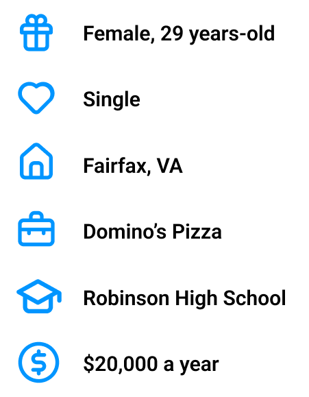
MOTIVATIONS
The paratransit gets her to work and back to her apartment twice a week
She loves how affordable it is and likes John, the driver
Sometimes she will talk to John or whoever else is on the bus but mostly she listens to music during the ride
NEEDS
To schedule her rides on her mobile device each Monday afternoon
The bus to arrive within the schedule time so that she is not late to work or has to find a different ride last minute
To feel independent by finding her own way to work and back
GRIEVANCES
When someone on the bus makes them late or is talking too loud
She has a different driver than Carl
There are no phone charging outlets on the paratransit bus
Empathy Map
To further my ability to empathize and define what this desktop site needs to include, I did an empathy map for my persona, Nicki. This exercise helps me get into the mind of the user and design for THEM not for what I think is best.
Flows
Now that I have completed the empathy phase and have gathered an understanding of my persona’s actions and feelings, I began mapping out what capabilities the desktop site for Bay Transit should have. I did that with user and task flows.
There are 3 task flows shown here. Top - user schedules a ride. Middle - user submits a donation. Bottom - user logs in and adds a ride to their cart.
There are 2 user flows show here. Top - user decides how they want to search and schedule a ride. Bottom - user decides how much they want to donate after reading the About Us page.
UI design
In the design phase, I gave BayTransit an updated brand identity (new logo is on the right) to compliment the friendly, welcoming feel the site design would strive to have.
Sketches TO WIREFRAMES
Based on my direct competitor research and feedback from interviews, what BayTransit was missing was the ability to schedule rides online and to donate to their mission. These are the major additions I implemented into their site re-design. You will also see a build out of their About Us and In The News page.
Prototype
After designing all of the high fidelity wireframes, I brought the entire experience to life through Figma’s prototyping tool. This prototype was tested by 4 users during the testing phase.
Usability Testing
I was able to get this prototype in front of 4 people to click through and test if they could successfully book a ride and donate without any assistance from me. I was pleased to have my friend Katie, with Cerebral Palsy, be one of those usability testers.
Participants
1 Male, 3 Females
26-29 years-old

Success rate
3 out of 5 participants were able to successfully complete the flow without aid

Methods
Remote moderated over Zoom & Google Hangout
Affinity Map
The user testing results were compiled into this affinity map to help prioritize changes and evaluate their value. You will see an iteration I made based off of Participant 3’s feedback regarding the donate page.
Left - first draft of the donation page’s “Date of withdrawal” option. Right - user was confused by the placement and context of this drop down button so this draft was created to amend confusion about when their donation would withdrawal from their account.
Reflection
CHALLENGES
Low applicability; Though I made frequent attempts to reach out to Bay Transit, I never connected with their team. Therefore missing the opportunity to interview real users of their services and address current pitfalls they have with their website.
Low user testing success; I was able to have Katie, with Cerebral Palsy, test my prototype. However she was not able to complete the flow without some assistance from her mom, sitting next to her during the test.
LEARNINGS
Wording a survey; This was the first survey I distributed in my product design career and learned the terminology to use when phrasing the gender identity question that is common in a survey.
Accessibility; A high contrast ratio, a translate page option, and simple, bookish wording were all things I learned to implement in this design to make it accessible for a wider range of users.
