
Added Feature
Added Feature for Mobile Banking
As America’s gig economy grows, the income of over 36% of all US workers does not come from one, long term employer. So squirreling money away from a scheduled direct deposit isn’t applicable. This is a proposed design solution after feedback from mobile bank users that they need more control over internal bank account transfers with Bank of America.
This project is for an assignment I completed for Designlab’s UX Academy and is not an existing feature for the Bank of America mobile app.
Duration of Project
2 Weeks / 80 Hours

Project Lead
I was the end-to-end UX/UI designer for this project

Tools Used
Figma, Adobe Illustrator, Whimsical, Google Forms, Miro
The Problem
Mobile bank users are unable to customize their automatic transfers between accounts and are turning to third party apps to help them budget.
My Hypothesis
If mobile bank users had more control over automatic transfers, they would not need third party apps to help them budget and save their money.
Competitive Research
I began the empathize phase of this project with market research and a SWOT analysis of Bank of America's direct and indirect competitors to understand what other banks and third party apps help users customize their automatic transfers.
Chase, Bank of America’s direct competitor for this feature, allows users to set up automatic transfers through a program called "Autosave." Here, users can transfer money from one account to the other after they have received a deposit over a certain amount. They do not, however, let you transfer into more than one account in one transaction. B of A’s indirect competitors have various automatic savings systems set up however none of them allow the user to:
Transfer money after receiving a deposit over a certain amount
Split a transfer amount into more than one account in the same transaction.
Interviews
HABITS
All participants use mobile banking for manually transferring money between accounts to save and budget
4 out of 5 participants use direct deposit through their employer to budget and save money
2 out of 4 participants prefer manual transfers so that they can control when and how much is moved between accounts
NEEDS
All participants need to use their banks mobile app
All participants need direct deposit set up by their employer
3 out of 4 need an app to help them budget and save money
1 out of 4 participant does not use automatic transfer as they need to control every transfer manually
GRIEVANCES
All participants complained about the user interface of their banking app
3 out of 4 participants use third party apps because they are easy to use and visually appealing
3 out of 4 participants want more control over their automatic transfers without going through their employer
1 out of 4 participants have an inconsistent income and is frustrated they can't set up automatic transfers on deposits
Participants
2 Male, 2 Female
26–32 years-old

Mobile Banking
All participants use their bank’s mobile app for saving money
3rd party apps
3 out of 4 participants use third party apps for saving money
participants
4 Male, 16 Female
20–40 years-old
Mobile Banking
All participants use their bank’s mobile app

transferring money
15 out of 20 participants transfer money between their accounts to save and budget money
Survey
HABITS
11 out of 20 participants use a third party app for budgeting and saving money
11 out of 20 participants use their banks mobile app monthly
5 out of 20 participants use their banks mobile app daily
NEEDS
15 out of 20 participants use a savings account to save money
15 out of 20 participants transfer money between their accounts to save and budget money
13 out of 20 participants are saving for their retirement
GRIEVANCES
12 out 20 participants want to be able to control when and how much money is automatically transferred into their accounts

key take away
All participants use their bank's mobile app on a daily or monthly basis and 60% of them wish they had more control over their automatic transfers.
Summary of Empathize phase
My research confirmed that the majority of people interviewed and surveyed use third party apps to help budget and save their money. And that the majority do so by transferring funds between accounts.
Persona
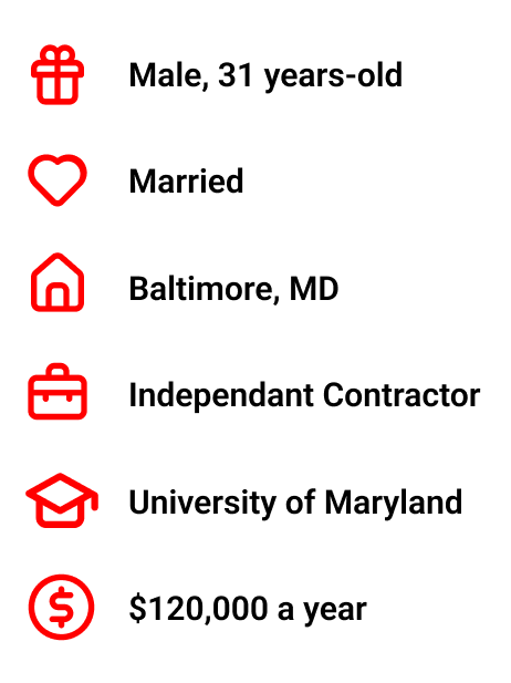
With the research conducted, Brian Rogers is the persona I created to summarize the motivations, needs, and grievances from the empathize stage so that I can begin the define phase.
MOTIVATIONS
He would like to be a home owner
He would like to be debt free
He is a newly wed and has started family planning
He likes to see when he has made progress in paying off his debt
NEEDS
To use his mobile app for budgeting and saving
To track all his incoming paychecks as they are deposited sporadically
To pay into his retirement independently
To build his credit to buy a home one day
GRIEVANCES
Having to manually transferring money into his two savings accounts
Always having to log into his mobile app to see if he has been paid for one of his projects
Not being able to see his progress for his saving goals
Empathy map
This empathy map was created to better understand Brian’s thinkings and feelings in regards to saving, budgeting, and using his mobile app.
Site map
The site map was created as part of the information architecture step in this phase. The red blocks are what is added to B of A’s current site map for the Transfer page of their mobile app.
Business & User Goals
As this project is intended to be a feature, added to an existing app, I created this venn diagram to make sure my intentions in designing this feature were still aligned with business and the technical team.
Task Flow
This task flow shows the steps a user would take to set up an automatic transfer based on the existing site structure the app already has. As you take a step back you realize how many steps the user is required to take to achieve this small task.
Sketches
Now that I had completed the empathy and defining phase, knowing that mobile banking users are looking for this feature’s capability and I had established an understanding of how this feature would fit into the site map of the app, I began the design phase with sketches of the added feature.
Low Fidelity Wireframes
Though designing within an establish brand system is limiting, working within those boundaries was freeing. The following wireframes show how a user would schedule a monthly transfer from one account, split into two savings accounts.
High Fidelity Wireframes
The style of this flow is based on how B of A has designed their manual transfer option, under the button "Make Transfer." I have added the feature under the button “Automatic Transfer".” The style of the icons, "Every Month," "Every Day," and "Every Deposit" are based off of the user's dashboard icons found on another screen in the app.
Prototype
uSER TESTED PROTOTYPE
This prototype shows a flow where the user is scheduling a daily automatic transfer of $50 between two savings accounts.
ITERATED PROTOTYPE
After feedback during the user testing phase, detailed below, this prototype reflects those changes made during the iteration step.

Usability Testing
Participants
2 Males, 1 Female
28–55 years-old

Success Rate
All 3 participants were able to complete the flow without aid

methods
In person testing and over Google Hangout
The testing phase for this first prototype proved helpful to see the holes in my initial design.
I wanted this flow to match the rhythm of other flows on the existing app, but in doing that this feature required the user to click through multiple screens before reaching confirmation of the automatic transfer. This proved to be cumbersome and inefficient for users.
While I believed my initial design was giving the user more control over their automatic transfers, I was still limiting them by having them pick between a monthly, daily, or deposit amount.
The initial goal for this feature was for the user to be able to split transfer amounts into different accounts. However, my prototype did not give them control over how to divide the lump sum into those accounts.
Users also asked for the freedom to terminate an automatic transfer either on a specific date or when they had reached their goal.
The feedback I received above has been addressed in the iterated screen to the left.
Reflection
CHALLENGES
Design oversights; The concept of offering the user more options when it comes to their automatic transfers seemed simple enough at first. But after usability testing, the freedom to customize their transfers showed more holes in the design.
User testing; I did not have enough time in the project timeline to have users test the iterated prototype.
LEARNINGS
Making iterations; I learned how to recover and edit a prototype that had a lot of issues raised during user testing.
Design systems; designing a feature within an existing design system was challenging at first but ultimately very freeing.
Solving a problem; identifying a shortfall in an established application took effort but was surprising empowering.
